728x90
반응형
□ float-left responsive
<!DOCTYPE html>
<html>
<head>
<meta charset="EUC-KR">
<title>Insert title here</title>
<style>
img.sinsang{
float:left;
width:100px;
height:100px;
padding:10px;
margin:10px;
}
</style>
<!--
화면배치
1) table에 넣어 배치
2) float로 배치
3) html5 semantic 배치 (table의 변형문법으로 배치)
-->
<!-- dhtml(dynamic html) vs xhtml(xml + html) -->
<!-- 반응형 웹을 모를 경우 대체할 수 있는 것 : bootstrap(오픈소스 라이브러리, 별도 css를 작성하지 않아도 디자인이 가능) -->
</head>
<body>
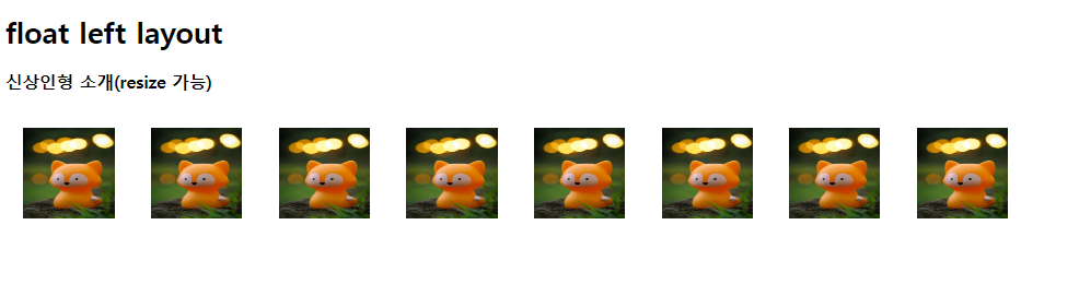
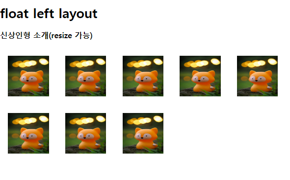
<h1>float left layout</h1>
<h3>신상인형 소개(resize 가능)</h3>
<img src="./krim/fox.jpg" class="sinsang">
<img src="./krim/fox.jpg" class="sinsang">
<img src="./krim/fox.jpg" class="sinsang">
<img src="./krim/fox.jpg" class="sinsang">
<img src="./krim/fox.jpg" class="sinsang">
<img src="./krim/fox.jpg" class="sinsang">
<img src="./krim/fox.jpg" class="sinsang">
<img src="./krim/fox.jpg" class="sinsang">
</body>
</html>
다음과 같이 창의 크기를 조절할 때 그림의 위치가 변하는 것을 확인할 수 있다.
□ text design
<!DOCTYPE html>
<html>
<head>
<meta charset="EUC-KR">
<title>Insert title here</title>

<style>

	#aa{
		word-spacing:25px; /* 단어 사이의 간격 */
		letter-spacing:15px; /* 글자간격 */
		text-decoration:overline underline;
		font-size:30px;

	}

</style>

</head>
<body>

	<div id="aa">글자 디자인입니다.</div>

</body>
</html>
□ <div> : margin, padding
<!DOCTYPE html>
<html>
<head>
<meta charset="EUC-KR">
<title>Insert title here</title>
<style>
div{
width:272px; /* 글자의 폭 */
padding:12px;
border:8px solid crimson; /* stealblue, teal */
/*
총 너비를 계산해보자
272 + 12(padding)*2 + 8(border)*2 = 312
*/
}
</style>
</head>
<body>
<!-- https://www.w3.org/wiki/CSS/Properties/color/keywords -->
<!-- css1 : lime(#00FF00), olive(#808000), teal(#008080) -->
<!-- css2 : aquamarine(#7FFFD4) -->
<!-- css3 : springgreen(#00FF7F), lightgreen(#90EE90), -->
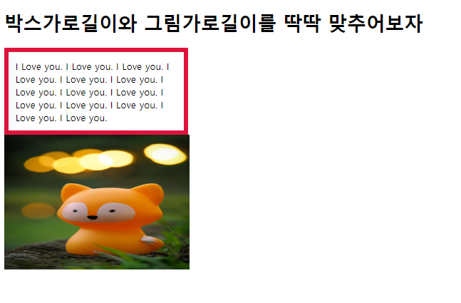
<h1>박스가로길이와 그림가로길이를 딱딱 맞추어보자</h1>
<div>I Love you. I Love you. I Love you. I Love you.
I Love you. I Love you. I Love you. I Love you. I Love you.
I Love you. I Love you. I Love you. I Love you. I Love you.
</div>
<img src="./krim/fox.jpg" width="312px" height="227px">
<!-- -->
</body>
</html>
□ table - separate
<!DOCTYPE html>
<html>
<head>
<meta charset="EUC-KR">
<title>Insert title here</title>

<style>

	table, tr, td{ /* td:cell */
		border:10px solid green;
		padding:30px 20px 10px 5px; /* top right bottom left 순서 */
		margin:30px;
	}

	#aa{
		/* border-collapse : collapse; */
		border-collapse:separate;
		/* table border와 td border 사이 간격 o
			collapse는 간격이 없음 */
		border-spacing:20px;
		/* border-spacing:20p 10px; (좌우)(상하), margin, padding과 순서가 다르다. 기본값 2px */
		margin:0px;
	}

</style>

</head>
<body>

	<table id="aa">
		<tr>
			<td>아하그렇구나</td>
			<td>역시그렇구나</td>
		</tr>
	</table>

</body>
</html>
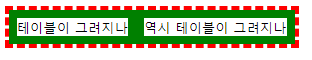
□ table-row-cell
<!DOCTYPE html>
<html>
<head>
<meta charset="EUC-KR">
<title>Insert title here</title>

<style>
	#tab1{
		display:table;
		border:5px dashed red;
	}

	#td1{
		display:table-cell; /* => <td>, <tr>은 display:table-row */
		border:10px solid green; /* dotted dashed */
	}

</style>

</head>
<body>

	<div id="tab1">
		<div id="td1">테이블이 그려지나</div>
		<div id="td1">역시 테이블이 그려지나</div>
	</div>

</body>
</html>
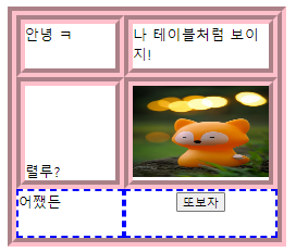
□ table-row
<!DOCTYPE html>
<html>
<head>
<meta charset="EUC-KR">
<title>Insert title here</title>

<style>

	.table1{display:table;}

	.trow1{display:table-row;}

	.tcell1{
		display:table-cell;
		width:100px;
		height:50px;
	}

	/* 그렇다면 semantic web에서 메뉴-내용 배치일 경우
		<td>메뉴</td><td>내용</td>의 그림을 생각해볼 수 있다.
	*/

	div{border:10px groove pink;} /* solid, dashed, dotted */
	span{border:3px dashed blue;}

</style>

</head>
<body>

	<div class="table1">

		<div class="trow1">
			<div class="tcell1"> 안녕 ㅋ </div>
			<div class="tcell1"> 나 테이블처럼 보이지! </div>
		</div>

		<div class="trow1">
			<div class="tcell1"> 렬루? </div>
			<div class="tcell1"><img src="./krim/fox.jpg" width="150" height="100"></div>
		</div>

		<div class="trow1">
			<span class="tcell1"> 어쨌든 </span>
			<span class="tcell1" align="center"><input type="button" value="또보자"></span>
		</div>

	</div>

</body>
</html>
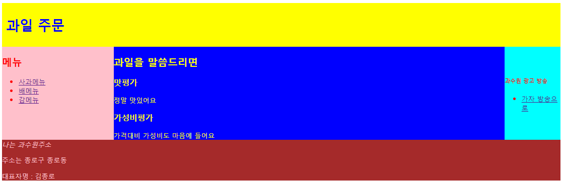
□ semantic-layout
<!DOCTYPE html>
<html>
<head>
<meta charset="EUC-KR">
<title>Insert title here</title>

<!-- html5 semantic 기법을 사용 -->

<!--
	float left, float right의 문제점을 생각해본다면
	줄이 바뀌는 경우 정확한 값을 지정하지 않으면 그림과 그림 사이 간격이 벌어짐
	<clear ... 사용해야
-->

<style>

	html, body{padding:0px; border:0px;}

	div{display:table; width:100%} /* table parent 즉, <table> 정의 */
								   /* 단, border에 대한 정의가 없으면 선은 없음 */
	/* 여기서는 div가 <table> 역할, 지금부터는 <tr> <td> 역할이 요구됨 */

	header{
		color:blue;
		background-color:yellow;
		padding:10px;
	}

	nav{
		display:table-cell; /* table-cell은 table의 <td>로 결국 float:left 역할 */
		color:red;
		background-color:pink;
		width:20%; /* 20/100이르모 좌측 20% 차지 */
	}

	section{
		display:table-cell;
		color:yellow;
		background-color:blue;
		width:70%;
	}

	aside{
		display:table-cell;
		color:red;
		background-color:cyan;
		width:10%;
		vertical-align:middle;
	}

	footer{
		color:pink;
		background-color:brown;
		width:100%;
	}
</style>

</head>
<body> <!-- header nav를 보고 HTML5 방식의 semantic web임을 알 수 있다. -->

	<header><h1>과일 주문</h1></header> <!-- h1 태그는 웹검색엔진과 연관 -->
	<div> <!-- <table>즉, display:table을 구현해주기 위해 -->
		<nav>
			<h1> 메뉴 </h1>
			<ul>
				<li><a href="#">사과메뉴</a></li>
				<li><a href="#">배메뉴</a></li>
				<li><a href="#">감메뉴</a></li>
			</ul>
		</nav>

		<section>
			<h1>과일을 말씀드리면</h1>
			<article>
				<h1> 맛평가 </h1>
					정말 맛있어요
			</article>
			<article>
				<h1> 가성비평가 </h1>
					가격대비 가성비도 마음에 들어요
			</article>
		</section>

		<aside>
			<h5>과수원 광고 방송</h5>
				<ul>
					<li><a href="#">가자 방송으로</a></li>
				</ul>
		</aside>
	</div> <!-- div 여기서 닫는다. -->

	<footer>
		<address>나는 과수원주소</address>
		<p>주소는 종로구 종로동</p>
		<p>대표자명 : 김종로</p>
	</footer>

	<!-- 왜 다음이 아니라 여기서 닫을까? 다시말해 왜 nav부터 열었을까? -->
	<!-- div를 쓰는 목적이란? -> nav부터 aside까지가 같은줄로 나와야 함 -->

</body>
</html>
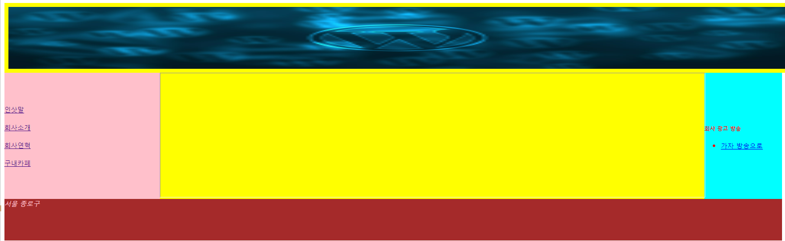
■ semantic-layout 연습
□ index.html
<!DOCTYPE html>
<html>
<head>
<meta charset="EUC-KR">
<title>Insert title here</title>

<!-- index.html -->
<!--
	web, spring 기본에서는 처음가동하는 파일명은 index로 시작
	단, spring boot에서는 index.html이 결과파일
-->

<style>

	html, body{padding:0px; border:0px;}

	div{display:table; width:100%}

	header{
		color:blue;
		background-color:yellow;
		padding:10px;
		width:100%;
		height:150px;
	}

	nav{
		display:table-cell;
		color:red;
		background-color:pink;
		width:20%;
		height:300px;
		vertical-align:middle;
	}

	section{
		display:table-cell;
		background-color:yellow;
		width:70%;
		height:300px;
	}

	aside{
		display:table-cell;
		color:red;
		background-color:cyan;
		width:10%;
		vertical-align:middle;
		height:300px;
	}

	footer{
		color:pink;
		background-color:brown;
		width:100%;
		height:100px;
	}

</style>

</head>
<body>

	<header><img src="logo.jpg" width="100%" height="150px"></header>

	<div>
		<nav>
				<a href="c1.html" target="s1">인삿말</a><br>
			<br><a href="c2.html" target="s1">회사소개</a><br>
			<br><a href="c3.html" target="s1">회사연혁</a><br>
			<br><a href="c4.html" target="s1">구내카페</a>
		</nav>

		<section>
			<iframe name="s1" height="300px" width="100%"></iframe>
		</section>

		<aside>
			<h5>회사 광고 방송</h5>
			<ul>
				<li><a href="#">가자 방송으로</a></li>
			</ul>
		</aside>

	</div> <!-- div 여기서 닫는다. -->

	<footer>
		<address>서울 종로구</address>
	</footer>

</body>
</html>
□ c1.html
<!DOCTYPE html>
<html>
<head>
<meta charset="EUC-KR">
<title>Insert title here</title>
</head>
<body>

	안녕하세요!

</body>
</html>
□ c2.html
<!DOCTYPE html>
<html>
<head>
<meta charset="EUC-KR">
<title>Insert title here</title>
</head>
<body>

	회사소개입니다. 1992 설립.

</body>
</html>
□ c3.html
<!DOCTYPE html>
<html>
<head>
<meta charset="EUC-KR">
<title>Insert title here</title>
</head>
<body>

	회사연혁이오 30년 가문

</body>
</html>
□ c4.html
<!DOCTYPE html>
<html>
<head>
<meta charset="EUC-KR">
<title>Insert title here</title>
</head>
<body>

	카페

</body>
</html>
□ bootstrap
<!DOCTYPE html>
<html>
<head>
<meta charset="EUC-KR">
<title>Insert title here</title>
<link href="https://cdn.jsdelivr.net/npm/bootstrap@5.3.0-alpha3/dist/css/bootstrap.min.css" rel="stylesheet" integrity="sha384-KK94CHFLLe+nY2dmCWGMq91rCGa5gtU4mk92HdvYe+M/SXH301p5ILy+dN9+nJOZ" crossorigin="anonymous">
<script src="https://cdn.jsdelivr.net/npm/bootstrap@5.3.0-alpha3/dist/js/bootstrap.bundle.min.js" integrity="sha384-ENjdO4Dr2bkBIFxQpeoTz1HIcje39Wm4jDKdf19U8gI4ddQ3GYNS7NTKfAdVQSZe" crossorigin="anonymous"></script>
</head>
<body>
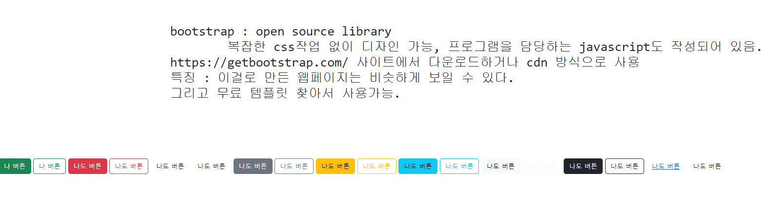
<pre>
<h2>
bootstrap : open source library
복잡한 css작업 없이 디자인 가능, 프로그램을 담당하는 javascript도 작성되어 있음.
https://getbootstrap.com/ 사이트에서 다운로드하거나 cdn 방식으로 사용
특징 : 이걸로 만든 웹페이지는 비슷하게 보일 수 있다.
그리고 무료 템플릿 찾아서 사용가능.
</h2>
</pre>
<button type="button" class="btn btn-success">나 버튼</button>
<button type="button" class="btn btn-outline-success">나 버튼</button>
<button type="button" class="btn btn-danger">나도 버튼</button>
<button type="button" class="btn btn-outline-danger">나도 버튼</button>
<button type="button" class="btn btn-priary">나도 버튼</button>
<button type="button" class="btn btn-outline-priary">나도 버튼</button>
<button type="button" class="btn btn-secondary">나도 버튼</button>
<button type="button" class="btn btn-outline-secondary">나도 버튼</button>
<button type="button" class="btn btn-warning">나도 버튼</button>
<button type="button" class="btn btn-outline-warning">나도 버튼</button>
<button type="button" class="btn btn-info">나도 버튼</button>
<button type="button" class="btn btn-outline-info">나도 버튼</button>
<button type="button" class="btn btn-light">나도 버튼</button>
<button type="button" class="btn btn-outline-light">나도 버튼</button>
<button type="button" class="btn btn-dark">나도 버튼</button>
<button type="button" class="btn btn-outline-dark">나도 버튼</button>
<button type="button" class="btn btn-link">나도 버튼</button>
<button type="button" class="btn btn-outline-link">나도 버튼</button>
<!-- 버튼 기본 9종류 -->
<!-- btn btn-priary, secondary, warning, info, light, dark, link -->
</body>
</html>
□ iframe
<!DOCTYPE html>
<html>
<head>
<meta charset="EUC-KR">
<title>Insert title here</title>
</head>
<body>
<!--
html 4.0, 4.01까지
frameset 사용, 지금은 x
iframe은 계속 alive, inner frame
-->
<!-- 서버가 다른 경우 -->
<iframe width="400" height="300"
src="https://www.naver.com/" frameborder="0"></iframe>
<iframe width="400" height="300"
src="https://www.google.com/" frameborder="0"></iframe>
<iframe width="400" height="300"
src="508_12_naya.html" frameborder="0"></iframe>
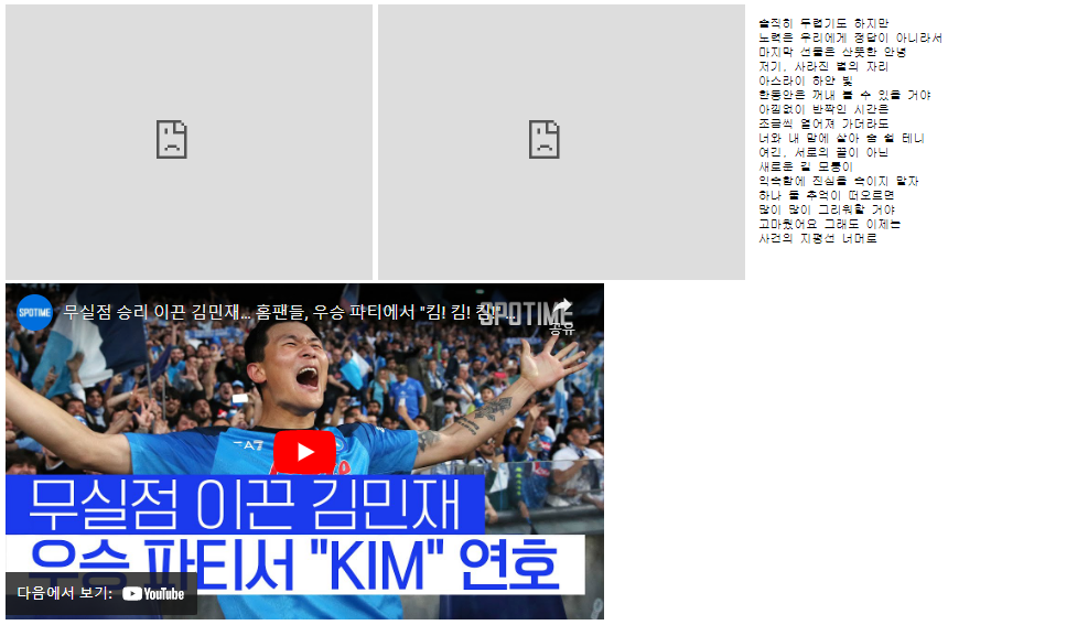
<iframe width="651" height="366" src="https://www.youtube.com/embed/IUVrrhr2cJQ" title="무실점 승리 이끈 김민재… 홈팬들, 우승 파티에서 "킴! 킴! 킴!" 열광 #SPOTIME" frameborder="0" allow="accelerometer; autoplay; clipboard-write; encrypted-media; gyroscope; picture-in-picture; web-share" allowfullscreen></iframe>
</body>
</html>
□ 미디어 쿼리 폼
<!DOCTYPE html>
<html>
<head>
<meta charset="EUC-KR">
<title>Insert title here</title>
<!-- bootstrap.jar로 반응형 웹을 작성하자 -->
<!-- media query -->
<style>
*{margin:0; padding:0;}
/* 반응형웹 media query */ /* 정적인 웹 static web */
@media all and (min-width:300px){/* and : 추가조건, min-width가 300 */
#mq1 img{width:100%;} /* 여기는 style */
}
@media all and (min-width:768px){
#mq1 img{width:50%;}
}
@media all and (min-width:1000px){
#mq1 img{width:25%;}
}
/*
@media (min-width:299px) {처리명령} 모바일
@media (min-width:300px) and (max-width:767px) {처리명령} 모바일
@media (min-width:768px) and (max-width:999px) {처리명령} 태블릿
@media (min-width:1000px) and (max-width:1024px) {처리명령} PC
@media (min-width:1300px) {처리명령} PC
*/
div{font-size:0;}
</style>
</head>
<body>
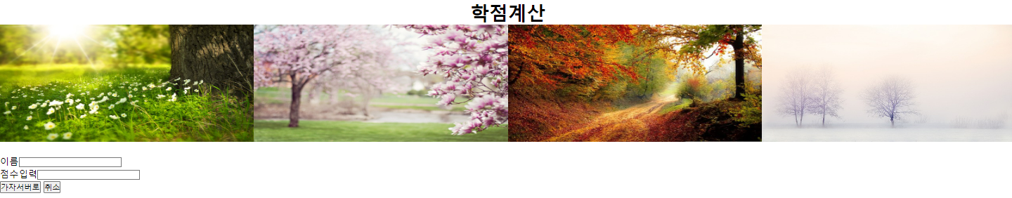
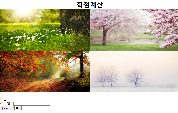
<h1 align="center">학점계산</h1>
<div id="mq1">
<img src="spring.jpg" height="200">
<img src="summer.jpg" height="200">
<img src="fall.jpg" height="200">
<img src="winter.jpg" height="200">
</div><br>
<form method="post" action="hello.jsp">
이름<input type="text" name="irum"><br>
점수입력<input type="text" name="jum"><br>
<input type="submit" value="가자서버로">
<input type="reset" value="취소">
</form>
</body>
</html>
위 코드를 실행하면 화면의 크기에 따라 사진이 조정되는 것을 확인할 수 있다.
728x90
반응형
'IT&코딩 > 국비지원' 카테고리의 다른 글
| 자바스크립트 - 2 (0) | 2023.05.18 |
|---|---|
| 자바스크립트 - 1 (0) | 2023.05.16 |
| CSS - 1 (0) | 2023.05.11 |
| HTML - 3 (0) | 2023.05.11 |
| SQL - 6 (View & Sequence & Index) (0) | 2023.05.09 |


